Solstice
a new music festival concept
palm springs, california


two different stacks of the solstice wordmark allows the branding to adapt to all of the different formats and usages required for to brand’s overall success. when presented in a non black or white format, the “sol” is colored in a secondary color, emphasising the spanish word for sun, something that represents both the desert location and the almost 25% of hispanic palm springs residents.
the stacks


created around the desert sun, the solstice mark is a unique yet versatile mark that is specifically designed for use almost any place imaginable.


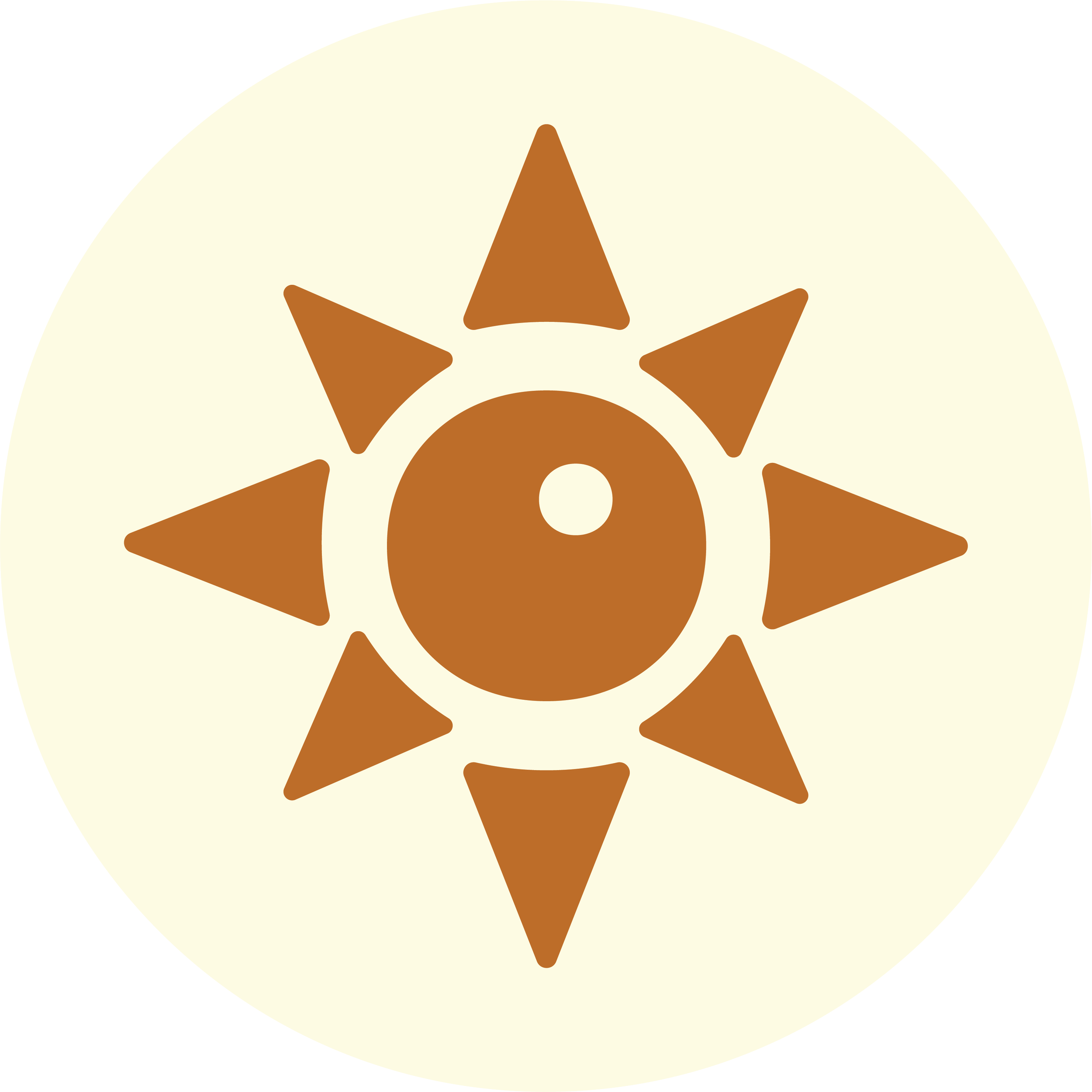

the mark
centered (like a lot of this branding) around Rian Hughes’ fantastic font Droog, the Solstice wordmark captures the fun and playful essence of the festival. once again, “sol” is presented in a different color. This (while not required by the branding documents), is a fun addition to add depth and substance to the mark
the wordmark


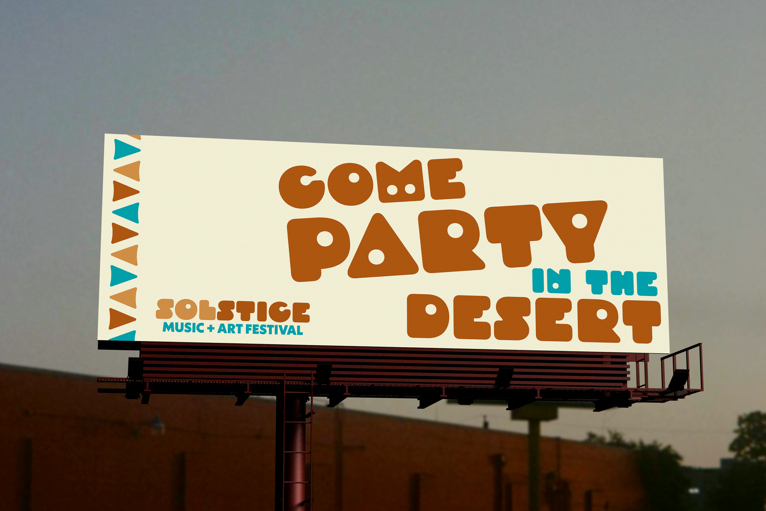
playful, fun, and lighthearted, “Come Party in the Desert” fits the Solstice brand to a tee.
the slogan

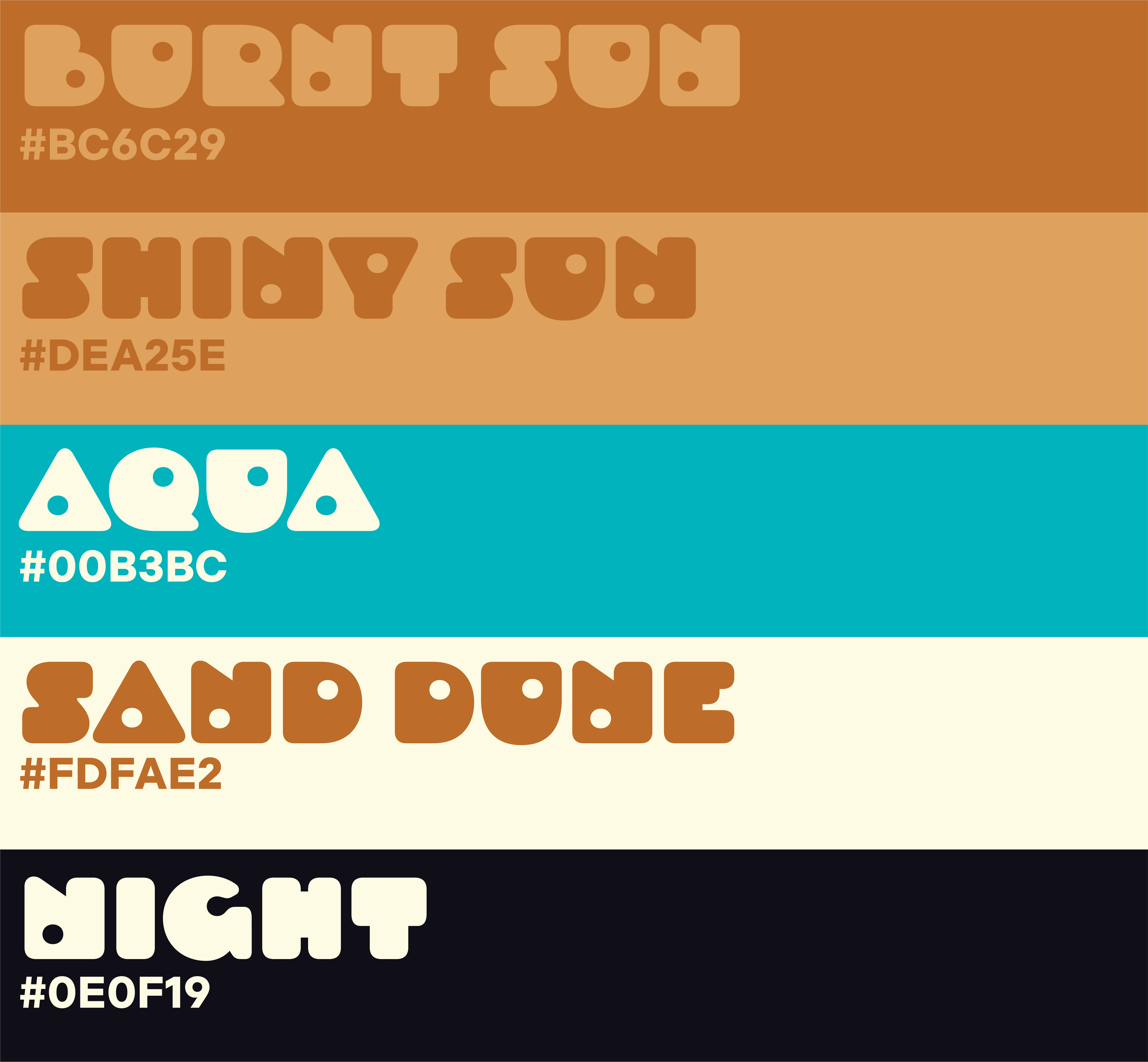
with a diverse color scheme that includes a unique black and a unique cream/white, solstice’s marketing has the ability to adapt to many different backgrounds/locations.